Category Archives: U.S. Department of Labor

From the Archives: We can’t succeed without Millennials

This was a very popular post from April, 2012. The data is pretty much the same. And it bears repeating.

Managers and supervisors (especially in the Baby Boomer cohort) in almost every type and size of business have been known to lament the lack of loyalty and so-called business savvy in the Millennial generation.

  • “They want to be promoted too fast!”
  • “They don’t want to pay their dues!”
  • “They don’t understand how things work!”
  • “They want too much flexibility!”
  • “When things don’t go their way they quit!”
  • “Why won’t they stay?”

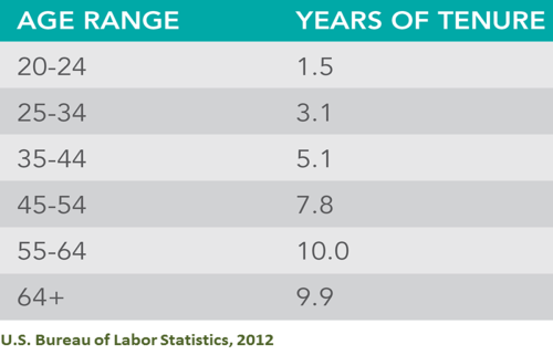
The bottom line is that organizations are finding it challenging to keep Millennials engaged and on the payroll.  In fact, with the average employment tenure of workers in the 20-24 year -old age group at 1.5 years (per the BLS), it’s challenging to keep all our employees engaged and the on the payroll.  (See my previous post on the Quits vs. Layoffs gap.  It might not be what you think!)

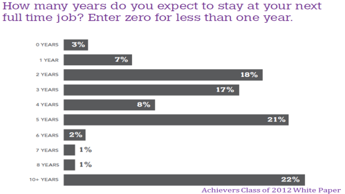
Achievers and Experience Inc. fielded their annual survey of graduating college students in January.  The data are eye opening.

Despite what we think we know about them, the vast majority of these about-to-enter-the-workforce Milllennials would really like to stay with their next (in most cases, first) employer for 5 years or longer!  Wait.  What?  Look at the chart below:

47% of the 8,000 college graduating respondents in the Achievers/Experience Inc. survey indicated that they expected to stay with their next employer five years or longer.  Note the language:  expect to stay not would like to stay!  That means when they join our organizations they have every expectation of making a career with us.  They’re not just accepting a job.  They’ve evaluated our EVP (Employer Value Proposition) as a match for the meaning they want to create in their lives through their work.  (Interesting to note that the biggest percentage of respondents expect to stay with their employer for 10+ years!)

So, OK.  This has got to be their youthful exuberance and relative inexperience speaking, right?  Well, I wonder if that really matters.

Employers need these Millennials.  Employers need these Millennials now.  Employers will need these Millennials more every day.  (See my recent post here.)

And employers need them to stay a whole lot longer than 1.5 years!

So what happens between “I expect to stay with my employer for 10 or more years…” and “…after one year with the organization I’m leaving for a better opportunity”?  I think we all know that answer to that question.

We don’t live up to the EVP we sold them.  We don’t engage Millennials the way they tell us they want to be engaged.  Instead, we…

  • make sure they fit into our existing career paths and job descriptions
  • focus on making sure they “pay their dues” – the way we did
  • keep our processes and rules rigid and unbending – and only pretend to listen when they offer up “different” ways of working
  • resist the notion that work can be done with excellence anywhere but in a cubicle
  • make it difficult for Millennials to interact with senior leaders
  • make it difficult for Millennials to collaborate with colleagues
  • designate social responsibility activities a perk instead of a foundational value
  • try to “lure” them to stay with tenure-based plaques and timepieces

These data are a wake-up call for employers.  It’s a message from our talent pipeline that they really do want to engage with us; they believe our employer brand marketing messages; they want to learn and grow with us.

It’s time to listen harder and make sure our employer brand messages aren’t experienced as bait and switch tactics.

I don’t know about you, but I’d hate for the Millennials to have such negative employment experiences at the beginning of their careers that they opt out of organizational life altogether before they’re 30.  We’d really be in a pickle then!

16 Comments

Filed under Achievers, Baby Boomers, Bureau of Labor Statistics, Business Success, China Gorman, Demographics, Employment Data, Engagement, Millennials, Rewards & Recognition, Student Job Search, Talent pipeline, U.S. Department of Labor

Forget the Skills Deficit: How About Filling Open Jobs?

data point tuesday_500

So the unemployment rate went up a little in May, from 7.5% to 7.6%. The Bureau of Labor Statistics deems this increase as “essentially unchanged.” Despite 175,000 more people working. How does this math work?

I’ve written about the how the unemployment rate in the U.S. is determined here and here. But here’s another slice of data to consider. It’s the number of job openings. The Job Openings and Labor Turnover Survey (JOLTS) published each month alongside the unemployment numbers, shares really interesting data each month. Along with the data about quits and hires, are data about job openings. Fascinating. Really.

JOLTS June 2013

So, although there were 3,757,000 job openings in April (down 118,000 from March, or “little changed” as the BLS describes it) the difference between hires and total separations was just 146,000 month over month. So on the surface, a net of 175,000 new jobs is curious.

More curious is matching the number of job openings to the number of unemployed people by industry. Economist Heidi Shierholz published a piece for the Economic Policy Institute last week that shows in stark relief that unemployed workers still significantly outnumber job openings in every major sector.  Based on analysis of the JOLTS and other data, the following chart is a snapshot of current job openings numbers by industry and the numbers of unemployed workers in those industries. It’s rather eye popping and raises lots of questions.

Unemployed far outstrips available jobs June 2013

Ouch! So think about this data when you read about employers not being able to find the right skills for their openings. Is it really skills they can’t find? Or something else? How hard are they looking? What BFOQs are they using that overlook millions of job seekers?

Curious, yes?

There are so many data points around employment, job openings, quits, hires, workers, unemployed workers, discouraged job seekers, skills, education levels, education spending… The data points come from bonafide sources (like the U.S. Bureau of Labor Statistics and  the Georgetown University Center on Education and the Workforce), quasi bonafide sources with bias (like the Economic Policy Institute, SHRM, U.S. Chamber of Commerce and AARP), vendor sponsored research and white papers, and millions of blogs and other media sources.

Lots of sources. Lots of data points. Lots of analysis. Lots of conflicting findings and conclusions.

The best we can do is be pro-active in finding sources that are transparent about their data and analysts who seem unbiased. And then be persistent in looking at all sides of an issue and smart in believing what you read.

On the issues of skills, jobs and unemployment, though, it seems that we don’t know what we’re doing. We may not even really know what the truth is. Except this:  we’ve got to do better at matching job openings with available talent. It’s clear that we haven’t figured this out. Not government, not business/employers, not education providers, not workers, not vendors, not recruiters.

Forget the skills deficit. What about filling the open the jobs?

5 Comments

Filed under Bureau of Labor Statistics, China Gorman, Data Point Tuesday, Economic Policy Institute, Employment Data, HR Data, Job Creation, SHRM, Skills Shortage, Structural Unemployment, U.S. Department of Labor, Unemployment

Gen Y’s Self-fulfilling Prophecy

data point tuesday_500

Accenture recently published its 2013 College Graduate Employment Survey Findings. Lots of great data. Especially if you plan to hire recent college grads. In fact, some of the data are surprising.

One of the important takeaways is that employers have unrealistic expectations for the skills of the hires they make out of college. They think these young people should be able to hit the ground running and are surprised and disappointed when they don’t. And to compound the problem, these employers are not investing in training initiatives to get the newly hired up to speed in the short term or effective in the long term. This is all pretty logical. It’s good data and if you plan on hiring entry level employees from the ranks of the newly graduated, you should read this.

But here’s what caught my attention. It’s about the willingness to commit. And it isn’t the first time I’ve seen data like these.

Young people, entering the economy for the first time, want to commit to their employers. It’s not what we expect, I know. We expect these youngsters to be gone in the career equivalent of sixty seconds. And sometimes they are. But it’s important to know that that isn’t what they want! This isn’t what they expect!

From Accenture:  The class of 2013 is expecting more career longevity from their first jobs:  68% of pending 2013 college grads expect to be at their first job more than 3 years compared to 49% of 2011/2012 college grads.

Accenture career longevity in first jobs 2013

And from the Achievers Class of 2012 white paper:

Achievers Class of 2012 White Paper

In this survey, more than 70% of 2012 college graduates expected to be with their first/next employer 3 years or longer — and 48% expected to be with their first/next employer 5 years or more. Surprising, right? Not what we expect, right? Not what we “know” about Gen Y, right?

But the BLS shows us what happens once they join our organizations:

BLS years of tenure by age

So, young people entering the economy for the first time with a newly minted degree are filled with optimism and have every intention of committing to their first employer for 5 years or more. Is it naivte or is it a real desire to commit, belong and make a difference?

And what happens once they start that first job that impels them out the door in 18 months or less?  Are employers so inept at selection that they really can’t hire employees that will persist? Are young people so naïve that they don’t really know what they’re signing up for and leave when reality doesn’t match expectations? Or, as the Accenture survey suggests, are young people disappointed when expected training and development doesn’t materialize and they leave in search of greater learning opportunities?

Clearly this is a complex issue with lots of dynamics, as the Accenture survey results show. However, if we started with the belief and understanding that young people really do want to engage and commit to their employer, would we be more likely to invest in developing their skills?

If we started with the belief and understanding that young people really do want to engage and commit to their employer, would we create onboarding processes that ensure expectations – on both sides – are being understood and met?

If we started with the belief and understanding that young people really do want to engage and commit to their employer, how would we approach them differently?

I suspect that most employers believe that there’s no return in investing in a talent pool that will be gone in 60 seconds.

I further suspect that the EVP that is sold in the recruiting process doesn’t exactly come to life once the recruit joins the organization.

But I suspect that the real issue is that Gen X and Baby Boomer managers, supervisors and recruiters believe all the negative stereotypes about Gen Y and their lack of commitment to any agendas other than their own — despite multiple data sources that show just the opposite. And we’ve ended up in this tough reality that has become a full-fledged self-fulfilling prophecy.

11 Comments

Filed under Accenture, Achievers, Baby Boomers, Bureau of Labor Statistics, China Gorman, Data Point Tuesday, Employee Value Proposition, Gen Y, GenX, HR Data, Turnover, U.S. Department of Labor

7.8% Huh?

Most people saw the U.S. jobs report numbers on Friday and thought, “this doesn’t make sense.”   All the data we’ve been seeing shows that employment continues to be weak and job seekers continue to drop out of the job market.

Monster’s Employment Index for September showed a 2 point decline month-over-month:

That’s a decline in U.S. online job posting activity.  This would indicate a slowdown in hiring not a hiring urge of massive proportions.

The Glassdoor Q3 Employment Confidence Survey shows a pretty strong worsening of confidence on the part of job seekers that they’ll find a job in the next six months:

This wouldn’t indicate that job seekers see people around them getting jobs.  And 59% of employed people don’t think they could replace their job in six months.  Six months!

So what’s the deal with the massive reduction in the unemployment rate from 8.1% to 7.8%?  Well, as I wrote here, the official BLS unemployment rate combines data from two surveys conducted by the U.S. government:  The Establishment Survey which surveys employers and the Household Survey which surveys thousands of households on a range of topics including employment.  The two surveys tell two very different stories in September.

Here’s the Establishment Survey portion of the jobs report from the BLS (U.S. Bureau of Labor Statistics):

Total nonfarm payroll employment increased by 114,000 in September. In 2012, employment growth has averaged 146,000 per month, compared with an average monthly gain of 153,000 in 2011.

So we’re down from the monthly average in both 2011 and 2012.  And the monthly average in 2011 was higher than this year’s monthly average.  Nonfarm payroll employment increased by 114,000 in September.  That isn’t enough to cover the new entrants into the labor force – much less hundreds of thousands of unemployed job seekers.

The Household Survey tells a different story:

Total employment rose by 873,000 in September, following 3 months of little change. The employment-population ratio increased by 0.4 percentage point to 58.7 percent, after edging down in the prior 2 months. The overall trend in the employment-population ratio for this year has been flat. The civilian labor force rose by 418,000 to 155.1 million in September, while the labor force participation rate was little changed at 63.6 percent.

So.  Total employment – as reported by individuals not employers – rose by 873,000 in September following “three months of little change.”  Despite declining confidence in almost every other survey we see, 873,000 people reported working in September who weren’t working in August.  It boggles the mind.

Here’s where those jobs came from:

The number of persons employed part time for economic reasons (sometimes referred to as involuntary part-time workers) rose from 8.0 million in August to 8.6 million in September. These individuals were working part time because their hours had been cut back or because they were unable to find a full-time job.

Part-timers.  600,000 new part-timers.  Part-timers who could be working as little as a couple of hours a week from home. Truly, it boggles the mind.

This is all very confusing.  We’re covered over in statistics, trends and data that tell us that the employment picture is stagnant at best.  Confidence in the job market continues to decline. And the unemployment rate went down .3% in one month.

I’m with Jack Welch:  I can’t connect these dots.

5 Comments

Filed under Bureau of Labor Statistics, Connecting Dots, Employment Data, Glassdoor, HR Data, Jack Welch, Monster, U.S. Department of Labor, Unemployment, Unemployment Rate

Low Employment vs. High Unemployment Around the World

As we prepare to attract, develop and retain skilled workers around the world, who works and who doesn’t work is interesting to me.  So I thought I’d share the following charts that I ran across in a collection of statistics published by the International Labor Comparisons Division of the BLS.  The first shows a comparison of the employment population ratios (proportion of the working-age population that is employed) by sex in 16 countries, adjusted to U.S. concepts.

According to the BLS definitions, employment includes all people who:

  1. worked at least 1 hour as paid employees, working in their own business, profession, or on their own farm, or worked at least 15 hours as unpaid workers in a family-operated enterprise, and
  2. all those who did not work but had jobs or businesses from which they were temporarily absent due to vacation, illness, bad weather, childcare problems, maternity or paternity leave, labor-management disputes, job training, or other family or personal reasons, regardless of whether they were paid for the time off or were seeking other jobs.

(Actually, I don’t know which is more interesting, the definition of employment above or the chart that follows…)

It’s interesting to note the differences in employment percentages  between men and women. Turkey (40.7),  Mexico (33.4), the Republic of Korea (22.4) and Japan (22) all have differences of 20 points or more between the sexes’ employment rates, and Italy (19.5) is right there as well.  Those are big gaps.

But add this to the mix:  there doesn’t appear to be a strong correlation between these low employment rates of women and the overall national unemployment rates.  See the chart below:

It intuitively makes sense that South Africa with the lowest percentage of women employed in the workforce would also have the highest overall unemployment rate.  However the relationship between these two data points isn’t as consistent as we might assume across other countries.

Look at the data for Mexico, Japan and Korea.  They all report low employment rates for women and low overall unemployment rates.  Not so intuitive.

That’s what I enjoy about people related statistics.  Just when you think you’ve figured it out, the data throw you curve ball.

What do you think the story is here?  Is it fair to try to find a pattern in data like this?  What conclusions can you draw from this?

2 Comments

Filed under Bureau of Labor Statistics, China Gorman, Connecting Dots, Demographics, Employment Data, HR Data, U.S. Department of Labor, Unemployment, Unemployment Rate

Surprise! Telecommuting Isn’t So Great for Employees…

The June Monthly Labor Review published by the Bureau of Labor Statistics (U.S. Department of Labor) had an interesting article about the surprising impacts of telecommuting in the U.S. workforce.  Surprising because the data analysis show that telecommuting hasn’t taken hold to any strong degree in the U.S.  And where it has taken hold, the impact isn’t positive:   from an employee perspective, the data suggest that the impact of telecommuting is negative from a work/life integration view!

Wait.  What? Isn’t telecommuting the perk that allows employees more flexibility and balance between work and personal life?  Well, no.  The data suggest not so much.

The Hard Truth About Telecommuting, by Noonan and Glass, says:  “telecommuting appears, instead, to have become instrumental in the general expansion of work hours, facilitating workers’ needs for additional work time beyond the standard workweek and/or the ability of employers to increase or intensify work demands among their salaried employees.”

The average number of hours worked per week from home by telecommuters is small.  And hasn’t been growing to any great degree since the mid-1990’s.  What is interesting is that most of telecommuting hours are overtime hours – they aren’t replacing office hours, they appear to be growing overtime hours.  So while more and more employers tout their “work-flex” telecommuting policies, the percentage of workers who telecommute isn’t growing.

Also surprising, is that younger workers are not telecommuting any more often than more mature workers and parents aren’t telecommuting more than the population as a whole!

The big value of telecommuting, according to this report, appears to accrue to a very few higher level professional employees.  For the rest, it actually appears to encourage longer work weeks.  As the report surmises, being available to telecommute may actually allow employers to increase expectation for work availability during evenings and weekends encouraging longer workdays and workweeks – the exact opposite of the intent.

It might be interesting to take a look at your organization’s use of telecommuting and determine whether this “flexible” approach is creating more or less stress, more or the same hours, more or the same productivity – and if it’s being utilized effectively.  In other words, is it an ineffective perk that feels good to offer and merely looks great on the “best” lists or is it a productivity and engagement tool that is actually producing value for your workforce?

9 Comments

Filed under Bureau of Labor Statistics, China Gorman, Engagement, HR Data, Monthly Labor Review, Telecommuting, U.S. Department of Labor

Data Point #11: Talent optimism vs. realism

We’re surrounded by all kinds of data points about the talent/skill shortage.  I wrote about it here and here.  Today we have two data points:  one comes from SHRM’s Q2 2012 Jobs Outlook Survey Report and the second comes from the BLS 2012 Occupational Outlook Handbook.

SHRM’s Jobs Outlook Survey has some interesting data from a small sample of its 250,000+ members.  (This particular survey was sent to 3,000 randomly selected SHRM members with 336 members responding, for an 11% response rate.)  These quarterly JOS surveys ask HR professionals interesting questions about optimism in job growth, planned changes in total staff levels, categories of workers companies will hire and categories of workers most difficult to hire in the previous quarter.

I was particularly interested in the responses to the question asking which categories of workers were most difficult to hire in the 1st Quarter of this year.  The sample is small (n=246), so the data are directional at best, but do line up with other data sources.

This data is congruent with BLS (U.S. Bureau of Labor Statistics) data relative to education level attainment and the corresponding unemployment rates in April.  The higher the unemployment rate, the lower the difficulty to hire:

  • Less than high school:                                   12.5%
  • High school no college:                                  7.9%
  • Some college or Associate degree:               7.6%
  • Bachelor’s degree or higher:                         4.0%

In other words, it’s more difficult to find skilled professionals and managers in this job market because there are fewer of them unemployed and there are fewer of them overall.  It’s easier to find service workers and unskilled manual workers because more of them are unemployed and there are more of them overall.

But still, as the SHRM report highlights, employers are having difficulty in hiring at all levels.  Which makes me wonder:  are we being unnecessarily restrictive in our job specifications?  Are we hiring people with college degrees when an associate degree would suffice?  Are we requiring associate degrees when a high school degree would be adequate?  I don’t know the answer, but considering the data is interesting.

The Occupation Outlook Handbook, published by the BLS, shows the projected job growth by education category in the 2010-2020 decade:

While the number of jobs created in this decade that will require a Bachelor’s degree or higher is predicted to be nearly 5 million, the number of jobs predicted to be created requiring some college/no degree or less is nearly 13 million.

So if the key to employment (and financial) security for the average worker is a Bachelor’s degree, but the greatest numbers of jobs being created in the next decade won’t require a Bachelor’s degree, how do we reconcile this as employers?

Do we hire college educated workers for jobs that only require a high school diploma?  Are we already doing that now?

Do we work to raise the general level of worker education because we believe it’s the key to global competitiveness?

Do we encourage students to enroll in career and technical education programs in and after high school rather than college because those are the skills needed in the economy?

The data around employers having difficulty finding the talent/skills they need isn’t as simple as it looks.  It’s actually quite challenging.  Under every layer of data is another layer of data.  Solving our talent attraction and acquisition needs won’t be solved with one tactic. But it’s a safe bet that solving our talent challenges will include strengthening relationships between employers and the education infrastructure to produce the skills our economy really needs.

As I look at the data, the optimist in me says we’re covered over in opportunity.  The realist in me says we’ve got a lot of work to do and not a lot of time in which to do it.

7 Comments

Filed under Bureau of Labor Statistics, China Gorman, Demographics, Education Deficit, Employment Data, HR, Post-secondary education, SHRM, Talent Management, Talent pipeline, U.S. Department of Labor, Uncategorized, Unemployment, Unemployment Rate

Data Point # 10: The Unemployment Rate Went Down? Really?

There is no irony in data.  Except if you put two graphs side by side that tell the same but different story.

The April employment data was released on Friday by the Bureau of Labor Statistics, which is part of the U.S. Department of Labor, which, of course, is part of the U.S. Federal Government.  The BLS paired these two graphs together.  Chart 1 shows the civilian labor force unemployment rate from April 2010 through April 2012.  Chart 2 shows the growth (or not) of nonfarm payroll employment in the same time frame.

Given this data, it’s a little hard to understand why  the unemployment rate went down .1 point to 8.1% during a month when far fewer jobs were created than in the previous 6 months.

During the slow crawl out of the Recession, many economists and pundits positioned that for the unemployment rate to hold steady month over month, a minimum of 150,000 new jobs would need to be created in that month.  And yet the data show that in a month when only 115,000 new jobs were created and the number of employed people was down 169,000, the unemployment rate still went down.  How does that math work?

Here’s the chart that makes sense of it all direct from the BLS Employment Situation Report:

The civilian labor force actually decreased from March to April by 342,000; the number of employed people decreased 169,000; the number of unemployed people (still looking for work) dropped by 173,000; and the number of people not in the labor force grew by 522,000.  What we can’t tell is how many of the unemployed became discouraged and stopped looking for work.  They drop out of all calculations.

If we do the math, the lower unemployment rates over the last several months are not the result of job growth, but rather a shrinking civilian labor force and a decrease in the labor force participation rate.

While the numbers of the unemployed – that’s people unemployed and actively looking for work – appear to be shrinking, the numbers of people “not in the labor force” is growing.  And growing rapidly – by nearly 3 million in the last year alone.  We can’t tell from this data whether the rapidly growing number of people not in the labor force are Baby Boomers retiring (that wouldn’t be totally unexpected) or more discouraged unemployed people dropping out of the job search.  But it’s a safe bet that it isn’t entirely people – Boomers or otherwise – voluntarily leaving the workforce.

So.  The number of discouraged unemployed workers grows at the same time the number of participants in the labor force is decreasing.  And that results in a lower unemployment rate.  Maybe data is ironic after all.

How’s this scenario?  What happens when the economy and the job market really improve and the discouraged unemployed workers re-enter the job market?  Under this math, the unemployment rate could very well go up.  The more workers are in the workforce — either employed or actively looking for work — the higher the number of jobs we’ll need to create to keep the unemployment percentage even.

Bottom line:  the lowering unemployment rate isn’t about more workers going back to work at all.  It’s about more workers leaving the economy.  Really.

16 Comments

Filed under Baby Boomers, Bureau of Labor Statistics, Demographics, Employment Data, U.S. Department of Labor, Uncategorized, Unemployment, Unemployment Rate

Data Point #5: We Can’t Succeed Without Baby Boomers

In earlier Data Point Tuesday posts (here and here) I’ve recommended the Bureau of Labor Statistics’ website as a treasure trove of talent management related data.  Another great source of useful information is SHRM, the Society for Human Resource Management.

SHRM’s research group works tirelessly to bring relevant, actionable trend and survey information to its members.  And if you aren’t a member (why aren’t you?), the value of SHRM’s research services alone is more than the cost of membership. *

Workplace Visions is part of SHRM’s Workplace Trends and Forecasting program and is published multiple times each year – as new data become available.  The reports are useful signposts for new developments that impact organizations, talent management and HR professionals.

The first such report published this year is “Changes to Retirement Benefits:  What HR Professionals Need to Know in 2012” (member protected).  It’s full of useful observations about changes coming to 401(k) plan rules, Social Security changes to keep an eye on and great data from EBRI (The Employee Benefits Research Institute).

One of the discussion points piqued my interest:  data from EBRI about the reduction in confidence by Baby Boomers that they will have enough money in their retirement years to live comfortably.  See the chart below.  This has big potential impact for employers.

The aha! is that while a steady stream of Americans still plan to retire in their early to mid-60s, many more workers are unsure when they’ll be able to retire – or if they’ll be able to retire.  As you can see from the chart, in 2007 70% of EBRI survey respondents reported some level of confidence in their retirement plans.  That number fell to 49% in 2011.  SHRM also cites data from Towers Watson surveys with similar outcomes.

What does this mean for talent management professionals?  Well, SHRM thinks that providing a stronger hand in retirement planning and financial education for Baby Boomers will help reduce retirement-related anxiety.  I absolutely agree.

Additionally, though, SHRM counsels HR professionals to “weigh the positives and negatives of employing an older workforce.”   They counsel that “older workers are often costlier to keep on board, due to higher salaries and health benefits costs.” Woah.  The  thought that employers will have robust options besides Baby Boomers and other older workers to staff their organizations isn’t supported by the demographic trends.

My take is a little different.  Here’s what the data say:

  • the U.S. population is growing more slowly leading a more slowly growing civilian work force (http://bls.gov/news.release/pdf/ecopro.pdf),
  • the Baby Boom generation moves entirely into the 55-years-old+ age group by 2020 and will represent 25.2% of the work force (up from 13.1% in 2000)
  • the “prime-age” labor cohort (ages 25-54) is projected to drop to 63.7% (from 71.1% in 2000) of the work force

So the engagement, development and retention of Baby Boomers and other older workers will be a very critical part of most organizations’ talent strategies because they’ll make up 25% of the available work force.  Providing incentives to stay, financial education for pro-active retirement planning and unique engagement strategies — among others — will all be part of talent strategy in 2020.  There won’t be any weighing the positives and negatives of employing an older workforce.  But there will be significant effort spent in figuring out how to keep the Baby Boomers’ skills, talents,and  organizational knowledge in play in the work force — and in our organizations.

At 25% of the available workforce, there won’t be other options.  We won’t be able to succeed without Baby Boomers.

*Full Disclosure:  I am SHRM’s former Chief Operating Officer

8 Comments

Filed under Baby Boomers, Bureau of Labor Statistics, Business Success, China Gorman, Demographics, Employment Data, HR, Retirement Planning, Talent Management, Talent pipeline, U.S. Department of Labor

Data Point #4: Cyclical vs. Structural Unemployment

The U.S. Department of Labor/Bureau of Labor Statistics is a gold mine of information.  It crunches massive amounts of data having to do with labor and the economy, and is prolific in providing projections for the future.  (See previous posts here and here.)

An interesting monthly publication put out by the BLS is the Monthly Labor Review.  The January edition included an Overview of projections to 2020 based on its Employment Outlook 2010-2020.  The overview contains a review of the underlying data behind all of the BLS’s projections.  Labor force participation by demographic, the connection between GDP and productivity, job growth by sector/industry, job growth by occupation, job growth by education level – all are included in this overview.

What I found most interesting was a graph and brief discussion comparing the most recent recession and the resulting time to labor market recovery to the previous four recessions.  Take a look at the graph.

We all know that the effects of the 2007-2009 recession are still being felt.  In fact, the graph shows that we are a long way from reaching “recovery to level at start of recession” — some 30 months out from the official end of the recession.  No surprise, but perhaps the combination of the length of the recovery together with the continued gap between where we are and the “recovery to level at start of recession” is noteworthy.  Also of note:  this overview reports that the BLS sets the “natural rate of unemployment” at 5.2%.  We’re still a long way from the recovery to level at start of recession rate — and a much longer way from the natural rate some 40 months from the official start of the recession.

The real question is, why is this recovery taking so long compared to the previous recoveries shown in the graph?  Labor market analysts discuss the cyclical vs. structural causes that continue to depress hiring and job creation.  Cyclical unemployment occurs when workers are laid off because of weak demand, but who expect to be re-hired when demand picks up – usually by the same organization, and usually in the same occupation or industry.

Structural changes in the economy also create job loss – our most recent recession proved that unequivocally.  Structural unemployment could also be caused by weak demand, but is fundamentally caused by other dynamics that impede workers’ abilities to return to work when demand picks up.  For example, new technology and resulting productivity gains may reduce the need to rehire workers with less current skills and may reduce the number of workers needed even after recovery.   As time goes on, the skills deficit of the structurally unemployed gets bigger and so they may well experience longer periods of unemployment.  Retraining in new occupations will be required for these workers in many cases.  Sound familiar?

As HR and talent management professionals take into account the impact of both cyclical and structural unemployment in their locations and industries, their approach to creating a robust talent pipeline will be far more realistic and attainable if they focus on causes of structural unemployment.  Just as employers are having difficulty finding the skills they need, the structurally unemployed are having difficulty finding new homes for their outdated skills.

Surely the answer is obvious to more than me.

7 Comments

Filed under Bureau of Labor Statistics, Cyclical Unemployment, Employment Data, Job Creation, Monthly Labor Review, Structural Unemployment, Talent pipeline, U.S. Department of Labor, Uncategorized, Unemployment