Tag Archives: Employment Data

The Workforce: Not As Simple as Red or Blue, Male or Female, or Generation

Jobvite’s annual Job Seeker Nation Study was published a couple of weeks ago. They took a whole new approach, given the current political environment in the U.S., and it’s fascinating. Subtitled, Finding the Fault Lines in the American Workforce, it looks at how divided our nation really is when it comes to attitudes and actions related to changing jobs.

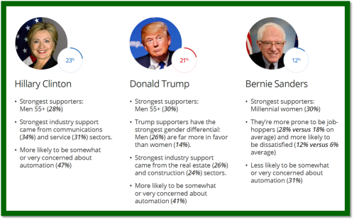
“If the past year taught us anything, it’s that we live in a divided nation. In fact, nearly 80% of Americans – an all-time high – believe the country is split in two. With this year’s Job Seeker Nation Survey of 2,000 Americans, we sought to define that split:  who are the two groups and what does the job seeking experience look like for each? The answer surprised us:  ‘Divided America’ is a myth. Sure, from 30,000 feet you see Blue vs. Red. Coast vs. Coast. But dig a couple layers deeper and you don’t find a neatly divided population… What we found is many different versions of the American job seeker.”

And then we’re off to the races with fascinating data points covering the workforce, job seekers, men, women, quitters, stayers, generations – different slices of workforce data that are sure to make you stop and think about what’s really happening with your employees.

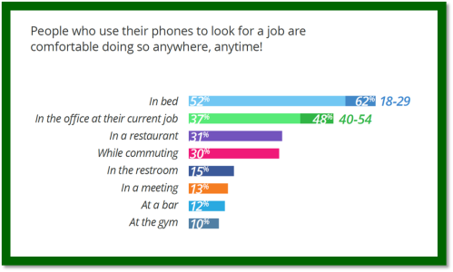
The finding that I found most interesting had to do with job sampling. For example, more than half of the respondents are satisfied at work (64%) – but 81% of them are open to new job opportunities. Additionally, 50% had at least one interview this year to explore options – with no intention of leaving their current position! Additionally, job seekers are not as happy as they used to be. In the last year, the percentage of workers satisfied at work has plummeted 10 percentage points to 64% (from 74%). But more concerning is that 82% are open to new job opportunities. That’s a tough message for employers.

Another fascinating data point – despite greater transparency around pay, performance and the like – is that workers routinely “sample” their options by interviewing for new jobs.

The dynamics of the workforce in 2017 are clearly not cut and dried – and certainly not as simple as Generation vs. Generation or Male vs. Female. Of course, we knew that. But this report shines a light on some more nuanced slices of the data and provides some surprising results.

I look forward to this report each year. (Here’s my take on last year’s report.) The Jobvite folks always serve up a different set of data points that add depth to the planning and conversations employers are having about their workforces. This year is no different. Take a look here. You’ll find some useful insights.


Advertisement

1 Comment

Filed under Big Data and HR, China Gorman, Data Point Tuesday, Employee Demographics, Employment Data, Generations at work, HR Data, Human Capital

Of Job Seekers, Smartphones, and the Election

data point tuesday_500

Jobvite’s Job Seeker Nation Study for 2016 is out. It’s always an interesting read. (Here’s my post on their 2015 survey.) And this year is no different. There is information on who’s looking, who’s not looking, who’s having a hard time finding a job and who isn’t. There are some fascinating data points. Like most vendor “research,” this report is easy to read and very attractively packaged.

The leading themes are these:

  • the state of work is in flux and today’s job seekers are adjusting to a new reality
  • job seekers are concerned in the short term but optimistic in the long run
  • while nearly 75% of all workers are satisfied with their jobs, two-thirds are still open to new employment
  • jobs in the gig-economy are part of the new normal
  • concern about jobs becoming obsolete due to technology is growing

Jobvite CEO, Dan Finnigan, introduces the report:

“These findings emphasize the fact that the way we look for work, and the way we work, is changing significantly. The gig economy’s rapid growth is remarkable and the data demonstrate that the modern job seeker is now more flexible than ever.”

Two survey areas really caught my attention. The first, reports survey answers that indicate the use of mobile devices in job search means job seeking behavior happens everywhere, all the time:

Jobvite 2016 1

You should no longer assume that colleagues active on their smartphones in meetings are playing games or reading their Facebook feed. They could very well be researching their next employer! Even more troubling is what is happening behind closed doors at the office or in the cubicle farm!

The second survey area that caught my eye, was the section on job seekers and the presidential election. (Not kidding.) As of early February when the survey was fielded, only three presidential candidates had double digit support from job seeker nation:  Hillary Clinton (23%), Donald Trump (21%), and Bernie Sanders (12%). Looking at the demographics of candidate support and then correlating that support to concern that automation will diminish their job/career opportunities is either brilliant or something else. But I found it fascinating:

Jobvite 2016 2

Just when you thought the election couldn’t intrude into any more corners of your life…! But the data are interesting. Look at the demographics and industry sectors. And Hillary supporters are way more concerned that robots will take their jobs than those who feel the Bern. Fascinating.

That’s why I always look forward to the annual Jobvite Job Seeker Nation report. They vary the questions enough to make the results and insights different from year to year, and certainly more relevant. Give the survey a read. I think you’ll enjoy it.

1 Comment

Filed under China Gorman, Data Point Tuesday, Employment Data, Gig Economy, Human Capital, JobVite, Uncategorized

Kids Need Jobs, Too!

data point tuesday_500

When you think about our current economy you probably evaluate that we’re in a recovery period, a time in which the job market is slowly – very slowly – on the mend. You probably imagine employment rates on the rise, and would claim we’re faring considerably better than we were during the recent recession. And you’d be right. But for one group in our nation, this holds hauntingly, troublingly, untrue, and we need do our darnedest to figure out a solution because this is one important group of people:  they are our future.

A recent report by The Center for Labor Market Studies at Northeastern University and JAG (Jobs for America’s Graduates) examines in detail the employment outcomes of high school graduates from the class of 2012 who did not enroll in college, and the results were not positive. Employment rates for our nation’s teens over the last several years (all demographic, socio-economic, and schooling groups) have seen steep drops. These drops have been so steep that employment rates for teens have reached new historical lows for the post WWII period. High school students and young high school drop outs have seen the greatest differences in securing paid employment (of any type) in recent years and young high school graduates , especially those not enrolling in college in the fall after graduation, have seen both declining employment rates and a strongly reduced ability to secure full time work.

JAG Policy Brief #1

What’s concerning is the nature of these drops. Until recently the ability of America’s teens to obtain work has been fairly cyclical, with teen employment rates rising to above average during periods of job growth and falling during periods of recession. During the economic recovery of 2003-2007 however, teen employment rates did not see any significant rise, dropping from a rate of 70% in 2000 to 58% in 2003 and recovering only three points to 61% in 2007. Employment rates failed to increase again during the current job recovery from the recession of 2007-2009, dropping from 61% in 2007 to 46% in 2009 and holding there in both 2011 and 2012. These are the lowest employment rates for new non-college enrolled high school graduates in the U.S since the data series began being recorded in 1959.

The employment rates of high school graduates varied considerably by gender and race ethnic group and across the board male high school graduates fared worse than female graduates, their employment rates dropping to an all-time low of 44% in Oct. 2012. Family income also influenced employment rates, with high school graduates coming from higher income families (no surprise here) seeing a stronger likelihood for employment. Another important note though, is that the ability of employed High School graduates not attending college to obtain full time jobs has also declined dramatically since 2000. This number dropped to 43% in October 2012, the lowest full time job share ever recorded in in this data series.

The report combined the findings on the employment rates of non-college enrolled high school graduates with the share of the employed working full time to calculate their employment to population ratios, which are consistent with the declining employment statistics and darker still. In the month of October 2012 only 19 of every 100 high school graduates who did not attend college in the fall were employed full time, another historical low. As this study implores us, we need to think about the message and implications of these unemployment rates. Not only will this lack of employment adversely affect the future of these graduates in terms of lower employment rates, wages, and reduced training from employers, but it also sends the wrong message to youths still in school. How can we expect young people to understand the value of a high school degree, and support our claim that it’s important to stay in school, when their direct experience is observing the many idle graduates (their peers) with no employment and nothing to do? As of now, no new policy initiatives exist to address this large-scale labor market issue.

So it’s up to us. What are we going to do about it?


1 Comment

Filed under Andrew Sum, Center for Labor Market Studies, China Gorman, Data Point Tuesday, Employment Data, High School Graduates' Employment Rates, JAG, Student Job Search

From the Archives: We can’t succeed without Millennials

This was a very popular post from April, 2012. The data is pretty much the same. And it bears repeating.

Managers and supervisors (especially in the Baby Boomer cohort) in almost every type and size of business have been known to lament the lack of loyalty and so-called business savvy in the Millennial generation.

  • “They want to be promoted too fast!”
  • “They don’t want to pay their dues!”
  • “They don’t understand how things work!”
  • “They want too much flexibility!”
  • “When things don’t go their way they quit!”
  • “Why won’t they stay?”

The bottom line is that organizations are finding it challenging to keep Millennials engaged and on the payroll.  In fact, with the average employment tenure of workers in the 20-24 year -old age group at 1.5 years (per the BLS), it’s challenging to keep all our employees engaged and the on the payroll.  (See my previous post on the Quits vs. Layoffs gap.  It might not be what you think!)

Achievers and Experience Inc. fielded their annual survey of graduating college students in January.  The data are eye opening.

Despite what we think we know about them, the vast majority of these about-to-enter-the-workforce Milllennials would really like to stay with their next (in most cases, first) employer for 5 years or longer!  Wait.  What?  Look at the chart below:

47% of the 8,000 college graduating respondents in the Achievers/Experience Inc. survey indicated that they expected to stay with their next employer five years or longer.  Note the language:  expect to stay not would like to stay!  That means when they join our organizations they have every expectation of making a career with us.  They’re not just accepting a job.  They’ve evaluated our EVP (Employer Value Proposition) as a match for the meaning they want to create in their lives through their work.  (Interesting to note that the biggest percentage of respondents expect to stay with their employer for 10+ years!)

So, OK.  This has got to be their youthful exuberance and relative inexperience speaking, right?  Well, I wonder if that really matters.

Employers need these Millennials.  Employers need these Millennials now.  Employers will need these Millennials more every day.  (See my recent post here.)

And employers need them to stay a whole lot longer than 1.5 years!

So what happens between “I expect to stay with my employer for 10 or more years…” and “…after one year with the organization I’m leaving for a better opportunity”?  I think we all know that answer to that question.

We don’t live up to the EVP we sold them.  We don’t engage Millennials the way they tell us they want to be engaged.  Instead, we…

  • make sure they fit into our existing career paths and job descriptions
  • focus on making sure they “pay their dues” – the way we did
  • keep our processes and rules rigid and unbending – and only pretend to listen when they offer up “different” ways of working
  • resist the notion that work can be done with excellence anywhere but in a cubicle
  • make it difficult for Millennials to interact with senior leaders
  • make it difficult for Millennials to collaborate with colleagues
  • designate social responsibility activities a perk instead of a foundational value
  • try to “lure” them to stay with tenure-based plaques and timepieces

These data are a wake-up call for employers.  It’s a message from our talent pipeline that they really do want to engage with us; they believe our employer brand marketing messages; they want to learn and grow with us.

It’s time to listen harder and make sure our employer brand messages aren’t experienced as bait and switch tactics.

I don’t know about you, but I’d hate for the Millennials to have such negative employment experiences at the beginning of their careers that they opt out of organizational life altogether before they’re 30.  We’d really be in a pickle then!

16 Comments

Filed under Achievers, Baby Boomers, Bureau of Labor Statistics, Business Success, China Gorman, Demographics, Employment Data, Engagement, Millennials, Rewards & Recognition, Student Job Search, Talent pipeline, U.S. Department of Labor

Forget the Skills Deficit: How About Filling Open Jobs?

data point tuesday_500

So the unemployment rate went up a little in May, from 7.5% to 7.6%. The Bureau of Labor Statistics deems this increase as “essentially unchanged.” Despite 175,000 more people working. How does this math work?

I’ve written about the how the unemployment rate in the U.S. is determined here and here. But here’s another slice of data to consider. It’s the number of job openings. The Job Openings and Labor Turnover Survey (JOLTS) published each month alongside the unemployment numbers, shares really interesting data each month. Along with the data about quits and hires, are data about job openings. Fascinating. Really.

JOLTS June 2013

So, although there were 3,757,000 job openings in April (down 118,000 from March, or “little changed” as the BLS describes it) the difference between hires and total separations was just 146,000 month over month. So on the surface, a net of 175,000 new jobs is curious.

More curious is matching the number of job openings to the number of unemployed people by industry. Economist Heidi Shierholz published a piece for the Economic Policy Institute last week that shows in stark relief that unemployed workers still significantly outnumber job openings in every major sector.  Based on analysis of the JOLTS and other data, the following chart is a snapshot of current job openings numbers by industry and the numbers of unemployed workers in those industries. It’s rather eye popping and raises lots of questions.

Unemployed far outstrips available jobs June 2013

Ouch! So think about this data when you read about employers not being able to find the right skills for their openings. Is it really skills they can’t find? Or something else? How hard are they looking? What BFOQs are they using that overlook millions of job seekers?

Curious, yes?

There are so many data points around employment, job openings, quits, hires, workers, unemployed workers, discouraged job seekers, skills, education levels, education spending… The data points come from bonafide sources (like the U.S. Bureau of Labor Statistics and  the Georgetown University Center on Education and the Workforce), quasi bonafide sources with bias (like the Economic Policy Institute, SHRM, U.S. Chamber of Commerce and AARP), vendor sponsored research and white papers, and millions of blogs and other media sources.

Lots of sources. Lots of data points. Lots of analysis. Lots of conflicting findings and conclusions.

The best we can do is be pro-active in finding sources that are transparent about their data and analysts who seem unbiased. And then be persistent in looking at all sides of an issue and smart in believing what you read.

On the issues of skills, jobs and unemployment, though, it seems that we don’t know what we’re doing. We may not even really know what the truth is. Except this:  we’ve got to do better at matching job openings with available talent. It’s clear that we haven’t figured this out. Not government, not business/employers, not education providers, not workers, not vendors, not recruiters.

Forget the skills deficit. What about filling the open the jobs?

5 Comments

Filed under Bureau of Labor Statistics, China Gorman, Data Point Tuesday, Economic Policy Institute, Employment Data, HR Data, Job Creation, SHRM, Skills Shortage, Structural Unemployment, U.S. Department of Labor, Unemployment

7.8% Huh?

Most people saw the U.S. jobs report numbers on Friday and thought, “this doesn’t make sense.”   All the data we’ve been seeing shows that employment continues to be weak and job seekers continue to drop out of the job market.

Monster’s Employment Index for September showed a 2 point decline month-over-month:

That’s a decline in U.S. online job posting activity.  This would indicate a slowdown in hiring not a hiring urge of massive proportions.

The Glassdoor Q3 Employment Confidence Survey shows a pretty strong worsening of confidence on the part of job seekers that they’ll find a job in the next six months:

This wouldn’t indicate that job seekers see people around them getting jobs.  And 59% of employed people don’t think they could replace their job in six months.  Six months!

So what’s the deal with the massive reduction in the unemployment rate from 8.1% to 7.8%?  Well, as I wrote here, the official BLS unemployment rate combines data from two surveys conducted by the U.S. government:  The Establishment Survey which surveys employers and the Household Survey which surveys thousands of households on a range of topics including employment.  The two surveys tell two very different stories in September.

Here’s the Establishment Survey portion of the jobs report from the BLS (U.S. Bureau of Labor Statistics):

Total nonfarm payroll employment increased by 114,000 in September. In 2012, employment growth has averaged 146,000 per month, compared with an average monthly gain of 153,000 in 2011.

So we’re down from the monthly average in both 2011 and 2012.  And the monthly average in 2011 was higher than this year’s monthly average.  Nonfarm payroll employment increased by 114,000 in September.  That isn’t enough to cover the new entrants into the labor force – much less hundreds of thousands of unemployed job seekers.

The Household Survey tells a different story:

Total employment rose by 873,000 in September, following 3 months of little change. The employment-population ratio increased by 0.4 percentage point to 58.7 percent, after edging down in the prior 2 months. The overall trend in the employment-population ratio for this year has been flat. The civilian labor force rose by 418,000 to 155.1 million in September, while the labor force participation rate was little changed at 63.6 percent.

So.  Total employment – as reported by individuals not employers – rose by 873,000 in September following “three months of little change.”  Despite declining confidence in almost every other survey we see, 873,000 people reported working in September who weren’t working in August.  It boggles the mind.

Here’s where those jobs came from:

The number of persons employed part time for economic reasons (sometimes referred to as involuntary part-time workers) rose from 8.0 million in August to 8.6 million in September. These individuals were working part time because their hours had been cut back or because they were unable to find a full-time job.

Part-timers.  600,000 new part-timers.  Part-timers who could be working as little as a couple of hours a week from home. Truly, it boggles the mind.

This is all very confusing.  We’re covered over in statistics, trends and data that tell us that the employment picture is stagnant at best.  Confidence in the job market continues to decline. And the unemployment rate went down .3% in one month.

I’m with Jack Welch:  I can’t connect these dots.

5 Comments

Filed under Bureau of Labor Statistics, Connecting Dots, Employment Data, Glassdoor, HR Data, Jack Welch, Monster, U.S. Department of Labor, Unemployment, Unemployment Rate

Low Employment vs. High Unemployment Around the World

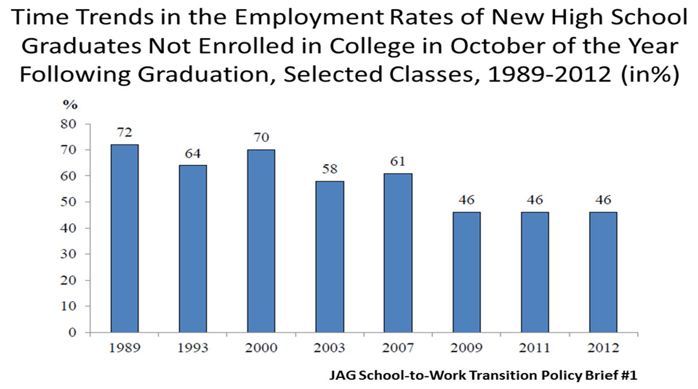
As we prepare to attract, develop and retain skilled workers around the world, who works and who doesn’t work is interesting to me.  So I thought I’d share the following charts that I ran across in a collection of statistics published by the International Labor Comparisons Division of the BLS.  The first shows a comparison of the employment population ratios (proportion of the working-age population that is employed) by sex in 16 countries, adjusted to U.S. concepts.

According to the BLS definitions, employment includes all people who:

  1. worked at least 1 hour as paid employees, working in their own business, profession, or on their own farm, or worked at least 15 hours as unpaid workers in a family-operated enterprise, and
  2. all those who did not work but had jobs or businesses from which they were temporarily absent due to vacation, illness, bad weather, childcare problems, maternity or paternity leave, labor-management disputes, job training, or other family or personal reasons, regardless of whether they were paid for the time off or were seeking other jobs.

(Actually, I don’t know which is more interesting, the definition of employment above or the chart that follows…)

It’s interesting to note the differences in employment percentages  between men and women. Turkey (40.7),  Mexico (33.4), the Republic of Korea (22.4) and Japan (22) all have differences of 20 points or more between the sexes’ employment rates, and Italy (19.5) is right there as well.  Those are big gaps.

But add this to the mix:  there doesn’t appear to be a strong correlation between these low employment rates of women and the overall national unemployment rates.  See the chart below:

It intuitively makes sense that South Africa with the lowest percentage of women employed in the workforce would also have the highest overall unemployment rate.  However the relationship between these two data points isn’t as consistent as we might assume across other countries.

Look at the data for Mexico, Japan and Korea.  They all report low employment rates for women and low overall unemployment rates.  Not so intuitive.

That’s what I enjoy about people related statistics.  Just when you think you’ve figured it out, the data throw you curve ball.

What do you think the story is here?  Is it fair to try to find a pattern in data like this?  What conclusions can you draw from this?

2 Comments

Filed under Bureau of Labor Statistics, China Gorman, Connecting Dots, Demographics, Employment Data, HR Data, U.S. Department of Labor, Unemployment, Unemployment Rate

Certificates: the New Associate’s Degree?

Georgetown University’s Center on Education and the Workforce has published a new report:  Certificates: Gateway to Gainful Employment and College Degrees. I’m a big fan of a previous report from these authors, Help Wanted: Projections of Jobs and Education Requirements Through 2018 and wrote about it here.

This new report gives a clear look under the hood of one of the staples of our post-secondary education infrastructure: the certificate.

Take a look. It’s not a hard read.

Uniquely American, certificates are widely varied in their positive impacts and largely ignored by private, public and government socioeconomic surveyors. The study’s authors contend that if certificates “with a demonstrated labor market value” were counted in official post-secondary surveys as “credentials” they would improve the U.S.’s post-secondary completion position from 15th to 10th among industrialized nations (OECD countries).

And 1 million certificates were awarded in 2010 – up from 300,000 in 1994.

Interesting data from the report include:

  • Certificates are the fastest growing form of post-secondary credentials in the U.S. increasing from 6% in 1980 to 22% today
  • 20% of certificate holders go on to get two-year degrees
  • 13% of certificate holders go on to complete four-year degrees
  • Workers with certificates earn an average 20% more than workers with just high school degrees

As talent management and HR professionals continue to struggle to find “qualified” workers to fill their openings, perhaps a new look at the experience and credentials they require might open a large segment of fully qualified workers – those with certificates instead of college degrees.

Something to think about.

5 Comments

Filed under Career Planning, Certificates, China Gorman, Demographics, Education Deficit, Employment Data, Post-secondary education, Talent Management, Talent pipeline, Unemployment

Data Point #11: Talent optimism vs. realism

We’re surrounded by all kinds of data points about the talent/skill shortage.  I wrote about it here and here.  Today we have two data points:  one comes from SHRM’s Q2 2012 Jobs Outlook Survey Report and the second comes from the BLS 2012 Occupational Outlook Handbook.

SHRM’s Jobs Outlook Survey has some interesting data from a small sample of its 250,000+ members.  (This particular survey was sent to 3,000 randomly selected SHRM members with 336 members responding, for an 11% response rate.)  These quarterly JOS surveys ask HR professionals interesting questions about optimism in job growth, planned changes in total staff levels, categories of workers companies will hire and categories of workers most difficult to hire in the previous quarter.

I was particularly interested in the responses to the question asking which categories of workers were most difficult to hire in the 1st Quarter of this year.  The sample is small (n=246), so the data are directional at best, but do line up with other data sources.

This data is congruent with BLS (U.S. Bureau of Labor Statistics) data relative to education level attainment and the corresponding unemployment rates in April.  The higher the unemployment rate, the lower the difficulty to hire:

  • Less than high school:                                   12.5%
  • High school no college:                                  7.9%
  • Some college or Associate degree:               7.6%
  • Bachelor’s degree or higher:                         4.0%

In other words, it’s more difficult to find skilled professionals and managers in this job market because there are fewer of them unemployed and there are fewer of them overall.  It’s easier to find service workers and unskilled manual workers because more of them are unemployed and there are more of them overall.

But still, as the SHRM report highlights, employers are having difficulty in hiring at all levels.  Which makes me wonder:  are we being unnecessarily restrictive in our job specifications?  Are we hiring people with college degrees when an associate degree would suffice?  Are we requiring associate degrees when a high school degree would be adequate?  I don’t know the answer, but considering the data is interesting.

The Occupation Outlook Handbook, published by the BLS, shows the projected job growth by education category in the 2010-2020 decade:

While the number of jobs created in this decade that will require a Bachelor’s degree or higher is predicted to be nearly 5 million, the number of jobs predicted to be created requiring some college/no degree or less is nearly 13 million.

So if the key to employment (and financial) security for the average worker is a Bachelor’s degree, but the greatest numbers of jobs being created in the next decade won’t require a Bachelor’s degree, how do we reconcile this as employers?

Do we hire college educated workers for jobs that only require a high school diploma?  Are we already doing that now?

Do we work to raise the general level of worker education because we believe it’s the key to global competitiveness?

Do we encourage students to enroll in career and technical education programs in and after high school rather than college because those are the skills needed in the economy?

The data around employers having difficulty finding the talent/skills they need isn’t as simple as it looks.  It’s actually quite challenging.  Under every layer of data is another layer of data.  Solving our talent attraction and acquisition needs won’t be solved with one tactic. But it’s a safe bet that solving our talent challenges will include strengthening relationships between employers and the education infrastructure to produce the skills our economy really needs.

As I look at the data, the optimist in me says we’re covered over in opportunity.  The realist in me says we’ve got a lot of work to do and not a lot of time in which to do it.

7 Comments

Filed under Bureau of Labor Statistics, China Gorman, Demographics, Education Deficit, Employment Data, HR, Post-secondary education, SHRM, Talent Management, Talent pipeline, U.S. Department of Labor, Uncategorized, Unemployment, Unemployment Rate

Data Point # 10: The Unemployment Rate Went Down? Really?

There is no irony in data.  Except if you put two graphs side by side that tell the same but different story.

The April employment data was released on Friday by the Bureau of Labor Statistics, which is part of the U.S. Department of Labor, which, of course, is part of the U.S. Federal Government.  The BLS paired these two graphs together.  Chart 1 shows the civilian labor force unemployment rate from April 2010 through April 2012.  Chart 2 shows the growth (or not) of nonfarm payroll employment in the same time frame.

Given this data, it’s a little hard to understand why  the unemployment rate went down .1 point to 8.1% during a month when far fewer jobs were created than in the previous 6 months.

During the slow crawl out of the Recession, many economists and pundits positioned that for the unemployment rate to hold steady month over month, a minimum of 150,000 new jobs would need to be created in that month.  And yet the data show that in a month when only 115,000 new jobs were created and the number of employed people was down 169,000, the unemployment rate still went down.  How does that math work?

Here’s the chart that makes sense of it all direct from the BLS Employment Situation Report:

The civilian labor force actually decreased from March to April by 342,000; the number of employed people decreased 169,000; the number of unemployed people (still looking for work) dropped by 173,000; and the number of people not in the labor force grew by 522,000.  What we can’t tell is how many of the unemployed became discouraged and stopped looking for work.  They drop out of all calculations.

If we do the math, the lower unemployment rates over the last several months are not the result of job growth, but rather a shrinking civilian labor force and a decrease in the labor force participation rate.

While the numbers of the unemployed – that’s people unemployed and actively looking for work – appear to be shrinking, the numbers of people “not in the labor force” is growing.  And growing rapidly – by nearly 3 million in the last year alone.  We can’t tell from this data whether the rapidly growing number of people not in the labor force are Baby Boomers retiring (that wouldn’t be totally unexpected) or more discouraged unemployed people dropping out of the job search.  But it’s a safe bet that it isn’t entirely people – Boomers or otherwise – voluntarily leaving the workforce.

So.  The number of discouraged unemployed workers grows at the same time the number of participants in the labor force is decreasing.  And that results in a lower unemployment rate.  Maybe data is ironic after all.

How’s this scenario?  What happens when the economy and the job market really improve and the discouraged unemployed workers re-enter the job market?  Under this math, the unemployment rate could very well go up.  The more workers are in the workforce — either employed or actively looking for work — the higher the number of jobs we’ll need to create to keep the unemployment percentage even.

Bottom line:  the lowering unemployment rate isn’t about more workers going back to work at all.  It’s about more workers leaving the economy.  Really.

16 Comments

Filed under Baby Boomers, Bureau of Labor Statistics, Demographics, Employment Data, U.S. Department of Labor, Uncategorized, Unemployment, Unemployment Rate